If you need to make a quick decision, here is the industry rule of thumb:
- Best for Energy Efficiency (LEED): Choose Green. It offers the highest “Light-to-Solar Gain” ratio, letting in natural light while blocking invisible heat.
- Best for Glare Reduction: Choose Grey. It is “spectrally neutral,” meaning it dims the sun without changing the true colors of the view outside.
- Best for Modern Aesthetics: Choose Blue. It provides a crisp, high-tech exterior look. (Note: “Ford Blue” is high-transparency; “Dark Blue” is high-privacy).
- Best for Warmth/Retrofit: Choose Bronze. Ideal for residential feel or matching masonry facades.
Pro Tip: For maximum performance, sourcing managers should always pair these body tints with a Low-E coating on surface #2.
Introduction
In commercial architecture, glass is never just about the view—it is the primary barrier between your controlled interior environment and the chaotic elements outside.
When you look at a skyline, the difference between a sleek blue skyscraper and a neutral grey office complex is visually obvious. However, for building glass wholesale, the invisible performance metrics driving those color choices are often misunderstood.
Selecting the right glass tint is a critical decision that balances architectural intent with building performance. It is where design meets physics. This guide explores the most common commercial glass tints to help you make sourcing decisions that look good on the façade and even better on the energy bill.
Why Color Matters
Balancing Visual Appeal with Thermal Performance
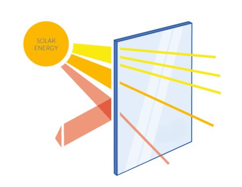
Tinted architectural glass does much more than simply color a building; it acts as a “thermal sponge.” Manufacturers create these tints by adding specific metal oxides—like iron, cobalt, or selenium—during the float glass manufacturing process. These additives change how the glass interacts with the sun.
Instead of allowing the sun’s heat to pass directly through to the interior, tinted glass absorbs a large portion of that solar energy. As the glass absorbs the energy, the pane itself heats up and then re-radiates that heat. The goal is to direct most of that heat back outside rather than letting it radiate into the office space.
The challenge for specifiers is finding the “sweet spot.” You need a tint that reduces glare and lowers cooling loads, but you must avoid going so dark that the interior feels cavernous or gloomy. It is a delicate tug-of-war between blocking heat and harvesting daylight.

The Technical Specs
Understanding VLT, SHGC, and Light Ratios
Before we dive into the colors, we need to understand the three core metrics that define how a window performs.
Visible Light Transmission (VLT)
Simply put, this is how much daylight actually gets in. If you hold a piece of standard clear glass up to the sun, it has a VLT of roughly 85–90%, meaning almost all the light passes through.
Commercial tints act like sunglasses for your building. A light tint might drop that transmission to 60%, while a heavy privacy tint could push it down to 15%. A lower VLT effectively kills glare, but go too low, and you’ll find yourself relying on artificial lighting even at noon.
Solar Heat Gain (SHGC)
While VLT handles light, SHGC handles heat. This coefficient measures the fraction of solar heat that enters the building. It is expressed as a number between 0 and 1, and in this game, lower is usually better.
A standard clear pane allows about 81% of the sun’s heat to pass through (an SHGC of 0.81). A high-quality tinted glass can drop this to between 0.40 and 0.60, significantly reducing the load on your HVAC system.
Spectral Selectivity
This is the “secret sauce” of high-end glass. Ideally, you want a glass that is “spectrally selective”—meaning it knows the difference between the visible light we want and the infrared heat we don’t.
A glass with high selectivity (often achieved by green tints) will let in plenty of brightness while aggressively blocking the invisible heat waves.
Now that the technical groundwork is laid, let’s look at how the specific color families stack up against one another.
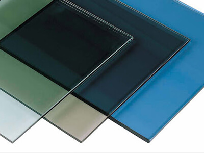
The “Big Three” Tints
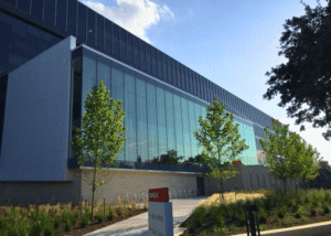
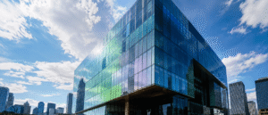
Blue Tint: The Modern Standard for Clarity and Productivity
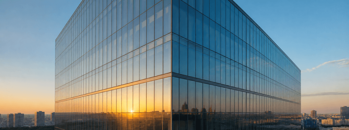
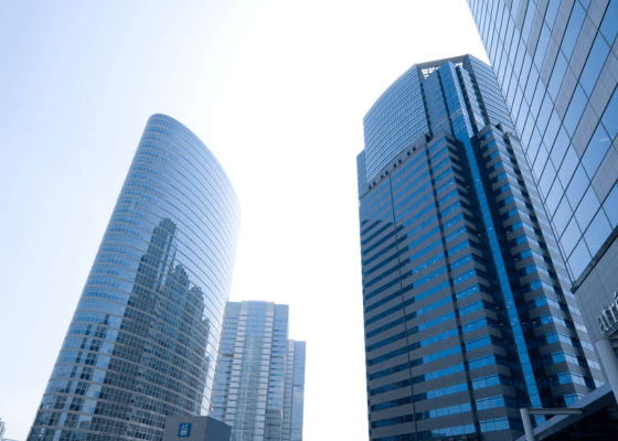
Blue glass has become the icon of modern architecture. It conveys a sense of technological sophistication and openness. When you see a crisp, sky-reflecting tower, it is likely using a blue tint.
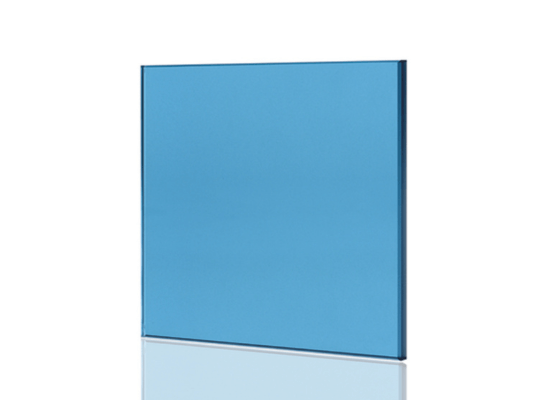
There are generally two camps here. First, you have the lighter variations, often called “Ford Blue” or Arctic Blue. These are designed for high transparency, usually keeping the VLT above 60%. They impart a cool, airy feel to interiors, which is often psychologically associated with clarity and productivity in office environments.
On the other end of the spectrum is “Dark Blue.” This is often used in tropical climates or high-exposure applications where the sun is relentless. A deep navy tint acts as a heavy filter, offering solar control comparable to dark grey glass but maintaining a vibrant, reflective exterior that mirrors the sky.
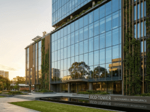
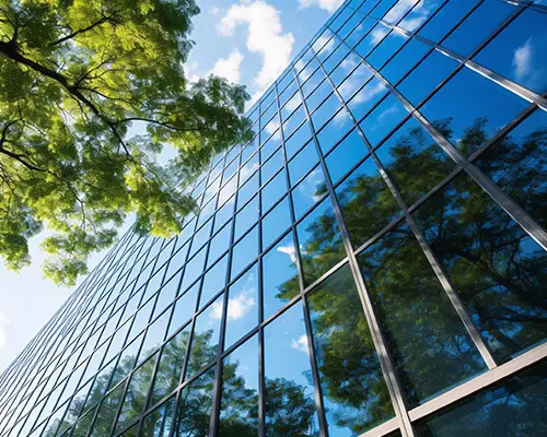
Green Tint: The Efficiency King for LEED Buildings
If energy efficiency is the absolute top priority, green is often the superior choice. This efficiency isn’t accidental; it’s chemical. Green tints are primarily created using iron oxide, and iron is naturally spectrally selective.
Because of this chemistry, green glass works harder than other colors. A standard 6mm green tint can offer a very bright VLT of 77% while maintaining a relatively low SHGC of 0.62.
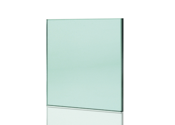
If you were to try and get that same level of heat protection from a grey glass, you would have to settle for a much darker room. For projects pursuing LEED certification, or for buildings that need to harvest daylight without paying a heat penalty, green is the industry workhorse.
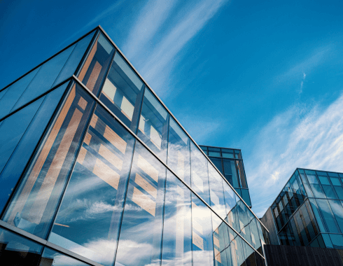
Grey Tint: The “True Color” Choice for Glare Reduction
While green is efficient and blue is modern, grey is the most “honest” tint. Architects love grey glass for its spectral neutrality.
Unlike blue or green, which act as color filters, grey glass acts like a dimmer switch. It does not alter the color of the world outside. When you look through a grey window, the trees still look green and the sky still looks blue—the view is simply darker. This makes grey the ideal choice for glare control, particularly on west-facing facades where the setting sun can be blinding.
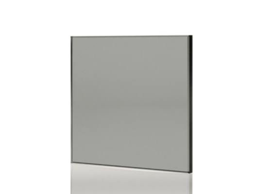
However, there is a trade-off. Grey glass is less spectrally selective than green. To get significant heat blocking from grey glass, you generally have to accept a darker tint. It relies on density, rather than chemical selectivity, to do the heavy lifting.
Specialized & Architectural Tints
Beyond the standard three, there are niche tints that serve specific architectural needs.
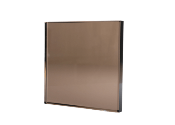
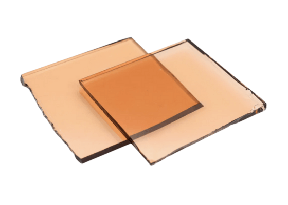
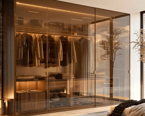
Bronze Glass
Bronze tint offers a distinct aesthetic warmth that modern cool-toned glass lacks. It is frequently used in retro-fit projects to match existing structures or to complement earth-toned masonry and brick facades.
Inside, it casts a warm, sepia glow. While less common in corporate towers today, it makes residential or hospitality spaces feel undeniably cozy.
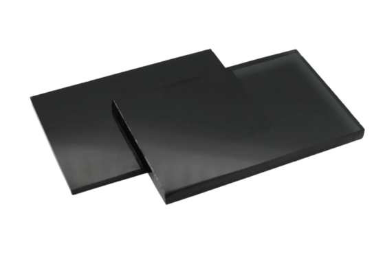
Black (Super Dark) Glass
Often marketed as “Super Grey” or “Dark Grey,” this glass pushes VLT down to 15% or lower. It creates a near-total one-way mirror effect during the day.
It is rarely used for vision glass in main office areas; instead, it is frequently used for “spandrels”—the opaque panels used to hide structural elements like floor slabs or HVAC equipment between floors, creating a seamless glass facade.
Pink Glass
While you won’t often see a pink skyscraper, pink glass has a place in boutique retail or interior partitions. It is purely an aesthetic choice used to create a specific mood or brand identity, rather than for solar performance.
To help you visualize the trade-offs between light, heat, and color, here is a direct comparison of the most common commercial specifications:
Quick Comparison: Glass Tint Performance
| Tint Color | Primary Advantage | Light Transmission (VLT) | Heat Blocking (SHGC) | Interior Aesthetic | Best Application |
| Grey | Glare Control | Low to Medium | High | True Color | West-facing facades; high-glare environments; privacy. |
| Blue | Modern Aesthetic | Variable | Moderate to High | Cool Tone | Corporate skyscrapers; coastal buildings; mixed climates. |
| Green | Energy Efficiency | High | High | Subtle Green | LEED projects; Eco-friendly builds; hot climates needing daylight. |
| Bronze | Warmth | Low to Medium | Moderate | Sepia / Warm | Retrofits; residential; matching brick or masonry facades. |
Strategic Sourcing Cheat Sheet
While local weather patterns provide the baseline for your decision, they are rarely the only factor. A skyscraper in a cold climate might still need dark glass for privacy, and a boutique hotel might prioritize color over thermal efficiency.
Real-world sourcing requires looking at the project through three distinct lenses: the climate, the occupant experience, and the structural integrity of the glass itself.
1. The Climate Lens: Efficiency vs. Light
Hot Zones: Prioritize Low SHGC
In regions where the sun is an adversary, your primary goal is shielding. Here, deep tones like Dark Blue, Dark Grey, or High-Performance Green are essential. The objective is to trap solar energy at the envelope before it spikes your air conditioning costs.
Cold Zones: Allows for Passive Solar Heating
However, moving into mixed or heating-dominated zones (Northern Europe, Canada, Northern US), the strategy flips. A heavy grey tint here creates a “cave effect” during short winter days.
For these projects, sourcing Clear, Light Blue, or Light Green allows for passive solar heating and keeps the interior morale high.
2. The Privacy Lens
Once you solve for heat, you must solve for eyes. Not every window serves the same function, and sourcing a single tint for an entire building can sometimes be a mistake.
Ground-Level and High-Density Areas
For lower floors facing busy streets, standard tints often fail to provide adequate privacy, turning offices into fishbowls. In these specific zones, sourcing from the Dark Series (15–25% VLT) is a functional necessity.
This creates a one-way mirror effect during the day, shielding employees or guests from pedestrian gaze without requiring blinds to be drawn 24/7.
Upper Levels and View Corridors
Conversely, for the upper floors where the view drives the lease price, the Euro Series (Standard 40–50% VLT) is the industry preference.
It maintains a connection to the skyline. Many successful projects actually use a “mixed aesthetic,” utilizing darker glass on the podium levels and lighter glass on the tower, tied together by a uniform reflective coating.
3. The Safety Lens: Avoiding Thermal Stress
This is the technical detail that often saves buyers from costly replacements later. Sourcing tinted glass requires a careful look at “Thermal Stress.”
The Danger of Dark Tints
Because tinted glass absorbs heat (rather than reflecting it), the pane itself gets hot—much hotter than clear glass.
If a Dark Grey or Dark Blue pane is partially shaded (by an overhang or a nearby building), one part of the glass stays cool while the sunlit part expands rapidly. This temperature difference can cause the glass to spontaneously crack.
The Sourcing Requirement
As a rule of thumb, the darker the tint, the higher the risk. When sourcing tints with a VLT below 40%, it is almost mandatory to specify Heat-Strengthened or Fully Tempered glass. While this increases the upfront unit cost, it eliminates the risk of thermal breakage, which is a far more expensive headache to fix once the building is occupied.
4. The Aesthetic Lens: Managing “Spandrel” Consistency
Finally, you must consider how the vision glass matches the non-vision areas. Commercial buildings use “spandrel glass” to hide concrete floor slabs and HVAC ducts between floors.
Matching the Look
Some tints are easier to match than others. Grey and Bronze tints are excellent at hiding internal structures; often, the vision glass and spandrel glass look seamless from the exterior. Green and Light Blue tints, however, are more transparent.
If you choose these lighter tints, you must ensure your supplier offers a high-quality opacifier (a colored film or paint applied to the back of the spandrel) that perfectly matches the transmitted color of the vision glass. Without this match, the building will appear striped rather than smooth.
FAQ: Common Questions
I hear these questions on almost every project. Let’s clear them up.
Blue vs. Green Glass: Which offers better energy savings?
If we are looking at the raw physics of standard float glass, Green glass generally wins. It offers better energy savings relative to the amount of light it lets in. It has that superior “Light-to-Solar Gain ratio” because of the iron content.
However, and this is a big however, glass technology moves fast. Modern high-performance Blue tints are closing this gap. If you love the look of blue but want the performance of green, ask your supplier for “high-performance” blue specs—they likely have a formulation that gets very close.
Does Grey glass distort the color of the view from inside?
No, and that is its greatest superpower. Grey glass is “spectrally neutral.”
Think of it like this: If you wear blue sunglasses, eventually your eyes adjust, but white paper still looks a bit blue. With grey glass, white paper looks white, just dimmer.
If you are designing an art studio, a showroom, or a space where color accuracy is vital, Grey is the only logical choice. Blue and Bronze tints will slightly shift the color spectrum of the interior light, which can affect how furniture and interior finishes appear to the eye.
Can I combine tinted float glass with Low-E coatings?
Yes, and for a modern high-performance building, you absolutely should. In fact, it is rare these days to see a commercial building without this combo.
Using a body-tinted glass (the outer pane) to absorb heat, in conjunction with a Low-E coating (usually on the inner surface of the outer pane) to reflect heat, is a standard strategy.
This combination delivers the best of both worlds: the aesthetic color you want from the tint, and the superior thermal insulation (U-Value) you need from the coating. It is the ultimate power couple of the glazing world.
What is the difference between “Ford Blue” and “Dark Blue”?
The names can be confusing, but it usually comes down to transparency.
- “Ford Blue”: This is a legacy term from when Ford Motor Company utilized glass manufacturing for its cars. It typically refers to a lighter, high-transparency blue with a VLT of 60-70%. It’s bright, happy, and clear.
- “Dark Blue”: This is a deeper, navy tone. It has lower transparency (VLT ~30-40%) and is used for stronger glare and heat control. It looks more “solid” from the outside.
Conclusion
Sourcing commercial glass is ultimately a balance of physics and philosophy. If you want true-color views and maximum glare reduction, Grey is your answer. If you want a modern, crisp aesthetic, Blue is the standard. If you want the highest natural light transmission with the most efficient heat blocking, Green is the winner.
By analyzing your specific climate zone and orientation—remembering that a west-facing wall needs more tint than a north-facing wall—you can select a glass specification that lowers energy costs while defining the visual character of your project.